Representing a national industry
To create a brand that would represent the Portuguese ceramics industry is not an easy task. More than an aesthetics approach, or a quality stamp, the brand needed to work on creating a clear positioning for the industry. Something unique, that we wanted the world to know about.

APICER (Portuguese Association of Ceramics and Domestic Glass Industries) approached us to define a brand strategy for the Portuguese ceramics sector (wall and floor tiles, tableware and decorative ceramics). This new brand is meant to signal an exciting new chapter for this industry and to enhance its capacity to prosper in foreign markets.
Looking at the international competitive arena, and analysing each competitor’s strengths and weaknesses allowed us to spot the opportunities to define an authentic, relevant and differentiating brand purpose and positioning.
Being aware that the brand would represent a wide and diverse range of brands, our main concern was to develop an identity with which every company could truly relate to.
To unify the two sub-sectors - Floor and Wall Tiles along with Utilitarian and Decorative ceramics - we took a deep dive into getting to know all the pain points, strategies, and points of view that each individual Portuguese company had.
The logo is a semiotic approach to both sectors.
The industry of ceramics brought to its simpler yet most meaningful form.
The goal was to create a simple yet dynamic icon that could stand the test of time while fulfilling the demanding task to represent both floor/wall tiles, and tableware and decorative ceramics. Through the visual and semiotic synthesis of each sub-sector in its simplest form we created a new symbol with a new meaning: Portugal Ceramics.
The square represents the tiles industry, as the circle stands as the representation of the vast majority of tableware and decorative ceramic objects (having the circle a historical connotation to ceramics due to the potter's wheel, an ancestral technology).


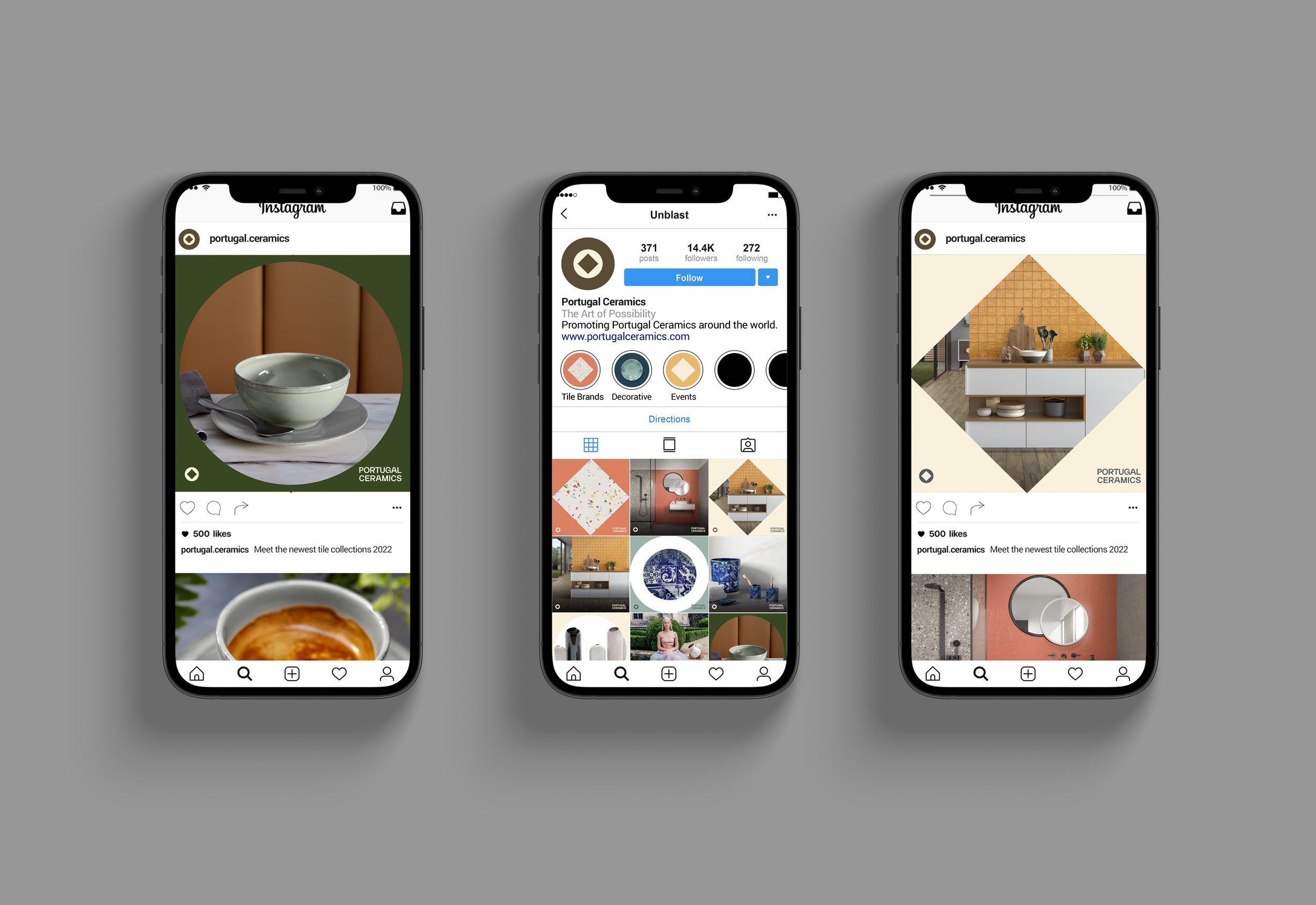
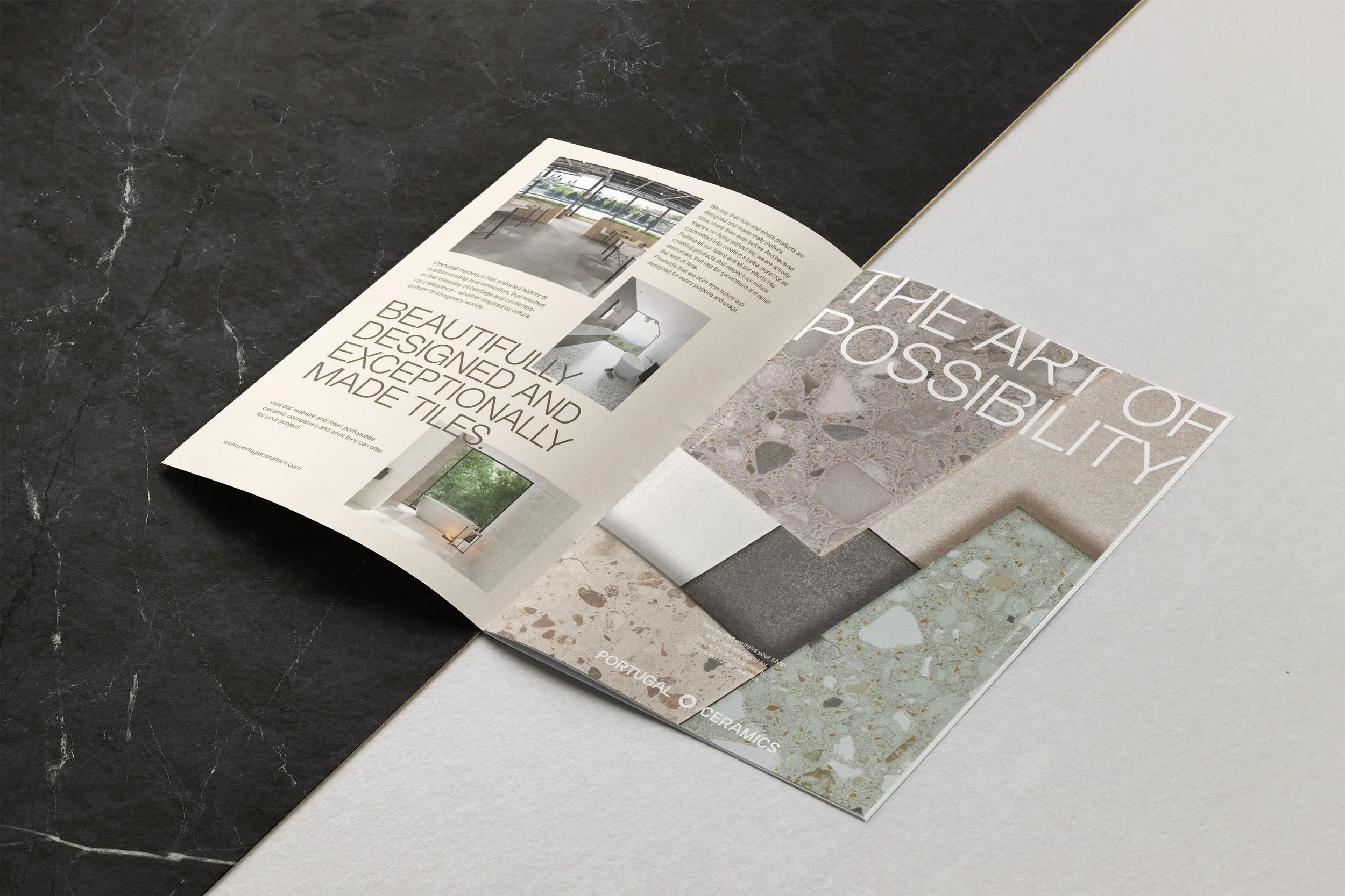
The graphic universe, based on the two simple forms, works as a dynamic system that allows the brand communication to evolve and adapt for a multitude of touchpoints, while keeping a strong visual reference to it’s logo - therefore, helping create a solid brand recognition.